Why I Redesigned TeamVis From the Ground Up
TeamVis launched in January. It didn’t go the way I’d hoped, and looking back, the reason isn’t hard to find: I’d built too much, and I hadn’t made any of it easy to understand.
So I’ve spent most of this year redesigning it from the ground up. Here’s what went wrong, what I changed, and what I learnt along the way.
What I launched
The idea was simple. When I worked as a developer with colleagues in America, Australia and the Philippines, I kept looking up time zones, checking national holidays and getting caught out by daylight saving. I wanted one place that showed when my team was working. (I wrote about why I built TeamVis at launch.)
What I launched was not simple. There were integrations with Slack, Microsoft Teams and Zoom, a chatbot, a menu bar app, a map, a globe, charts, an organisation chart, birthdays, work anniversaries and travel plans. The dashboard alone had well over a dozen pages. Every feature made sense on its own, and each one came from a real problem I’d had. Together, they buried the one thing TeamVis is actually for.
My own notes from that time describe the dashboard as messy and too complicated, more than once. When the person who built it thinks that, a new visitor has no chance.
Why it didn’t land
Someone arriving at TeamVis for the first time has one question: will this tell me when my team is working? The first version made them work for the answer. They had to pick a page, then a view, then a set of filters, before they saw anything useful.
It’s an easy trap as a developer. Building features is the part I enjoy, and every new one felt like progress. But there’s nothing micro about a micro startup. Once it’s live you’re also doing marketing, support, admin and finance, and a product that’s hard to explain makes every one of those harder.
Starting again
The redesign started with one rule: everything begins simple, and the detail is one click away.
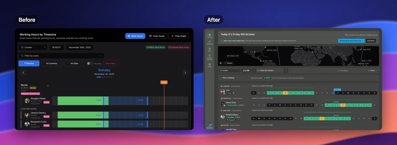
The old working hours page, and the new home page that replaces it.
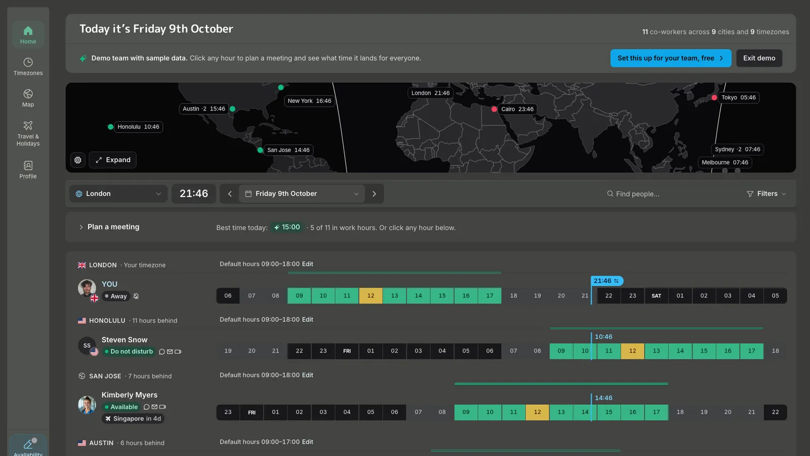
The home page now opens with today’s date, a small map of where your team is, and one row per person showing their working day against yours. Locations are thin dividers rather than boxes. Planning a meeting is a single line that suggests the best time today, and it only expands when you click it. The sidebar has five sections: Home, Timezones, Map, Travel & Holidays and Profile.
The map got the same treatment. It’s now just a map and a globe, with the list of people tucked into a panel you open when you need it.
I also narrowed the focus. TeamVis now concentrates on Slack and Microsoft Teams, and each part of the product has its own page explaining what it does: the menu bar app, the team map, the chatbot and the free world time tool. Before, the homepage tried to explain everything at once.
I spent a lot of time with tools people already like, such as World Time Buddy and timeanddate. The point wasn’t to copy how they look. It was to understand why they feel easy, and bring that into TeamVis.
What stayed the same
Some things were never up for debate. TeamVis doesn’t track people. It stores a general location rather than an exact one, it works from the hours people set rather than watching when they’re online (unless you choose to show Slack presence on the map), and it isn’t a surveillance dashboard for managers. That was true at launch and it’s still true now.
The goal hasn’t changed either: remote work should feel more connected, and that means making it less complicated, not more.
What I’d tell myself in January
Launch the smallest version that answers one question well. Watch where people get stuck before building the next thing. And if something feels complicated to you, it’s almost certainly worse for everyone else.
The redesign isn’t finished, and what people tell me decides what changes next. If you try TeamVis and something’s confusing, I’d really like to hear about it. Or have a look around the new demo first. No account needed.